
4 Ways to Keep ‘Book Now’ in Sight on Your Yoga Website
Ruth has a lift, a free Tuesday and no yoga mat. Keep booking within reach at the moment your website answers a new student’s last question.
Published by the GROW Formula® team · Updated
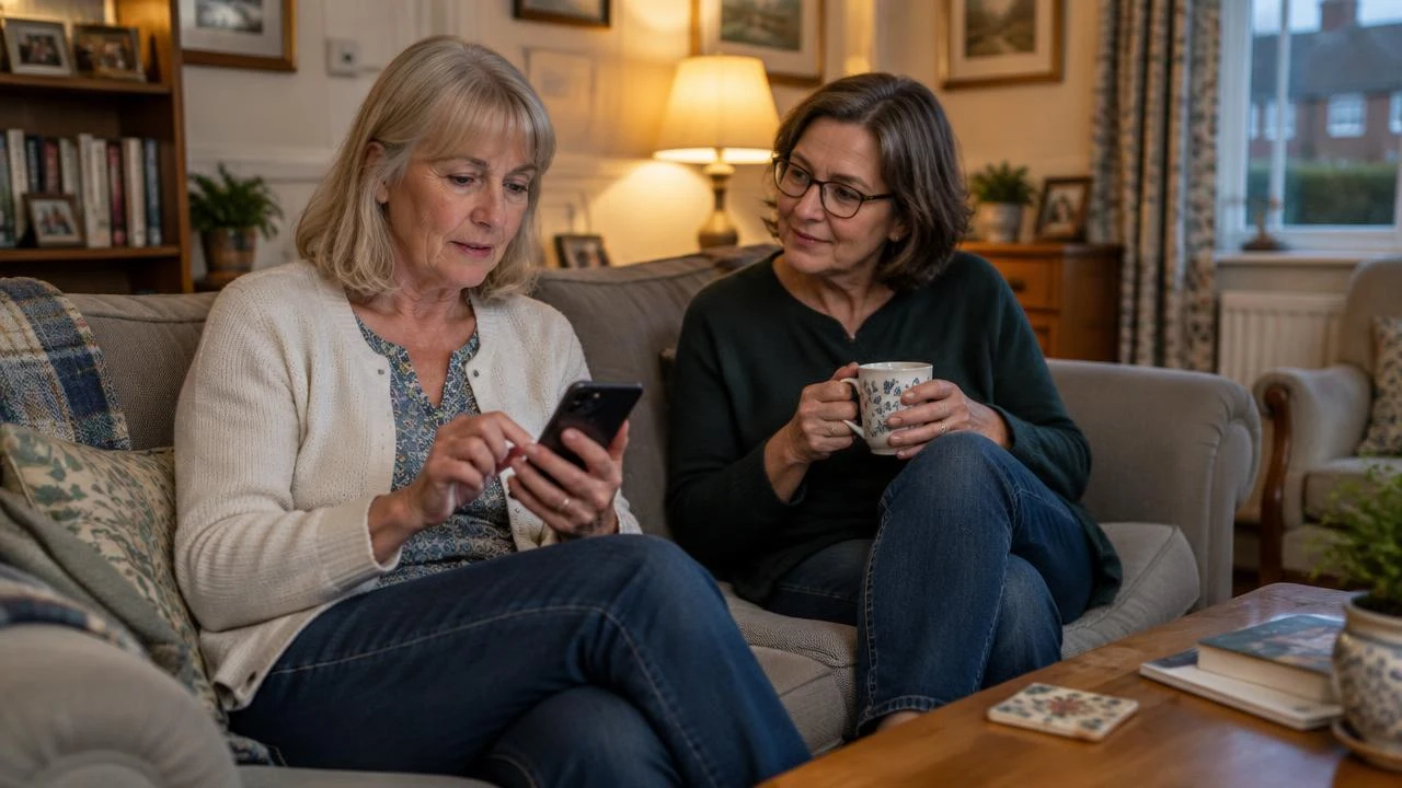
At 8.42 on Sunday evening, Ruth finally establishes that she can go to yoga. The class finishes at eight, her neighbour can give her a lift and the village hall has mats. This last detail matters. The only mat Ruth owns says Wipe Your Paws and has a raised rubber bone in the middle.
She’s found the information about mats halfway down a page called Your first class. She looks for the booking button. It was definitely on the website a minute ago. She scrolls up past a photograph of a woodland, taps three horizontal lines and ends up reading about a retreat in Portugal.
“Did you book?” asks her neighbour.
“I could go to Lisbon in April.”
“I meant Tuesday.”
If you teach yoga, the moment a student decides to book can happen anywhere on your website. For Ruth, it happened halfway down an FAQ, immediately after the sentence You can borrow a mat. That’s where she needed a Book now button. Here’s how to keep one in sight from the moment somebody opens your site until they enter the booking process.
2. Put the facts that earn the booking beside the invitation
A permanent button solves where do I book? Your class page still has to answer do I want to go?
Ruth’s yoga teacher, Sal, calls Tuesday’s session Evening Flow. Regulars know that means a small group and time to settle into each movement. Ruth pictures twelve people changing position simultaneously in response to a word she’s never heard, while she’s still working out which end of the mat is the front.
A short class listing can do more than a page of reassurance. For example:
Tuesday beginners’ yoga with Sal 7 to 8pm at Brookfield Village Hall · £12 for one class We start on the floor and move into standing poses. I demonstrate each sequence and leave time to try it. First-timers can join any Tuesday, and mats are available to borrow. Come through the side entrance by the noticeboard. Book now
Use your actual details. If students need to get down to the floor, say so. If chairs are available, explain how they’re used. Explain whether the price buys one class or a place on a course. These are the details that help someone decide for themselves whether a class fits them.
Give each class a link people can share. Keep teacher training and qualifications on a short bio page, with a recent photo so newcomers know whom to look for. A student who decides after reading your bio can use the same Book now button. Someone with a question can use a secondary email or contact link. Only the booking action needs to follow them around.
3. Make the button remember which class they chose
Ruth finds Tuesday beginners’ yoga and taps Book now. The booking system opens on Monday morning, displaying the teacher’s next available session. It’s advanced inversions. Ruth has been promoted very quickly.
The wording can stay the same across the website while the destination changes. Give your booking button a sensible destination for each starting point:
| Where the student taps ‘Book now’ | Where they should arrive |
|---|---|
| Homepage, teacher bio or general FAQ | Your live timetable, showing class names, dates, locations, prices and availability |
| A page for Tuesday beginners’ yoga | Available dates for that class, with the Tuesday sessions already selected or filtered |
| A specific Tuesday at 7pm | The booking details for that date, with the correct time, venue and price carried through |
| A class that has filled up | An accurate status and a useful action such as Join the waiting list or See the next available Tuesday |
If your provider only gives you one timetable link, make the class names on the timetable match your website exactly. Ruth can cope with choosing Tuesday beginners’ yoga a second time. Asking her to infer that it has changed its name to Group Product B in the intervening seconds is a less promising educational relationship.
Once someone enters checkout, let the booking system lead them through choosing a place and confirming it. The permanent site button has done its job. On the confirmation, repeat the date, address, arrival instructions and what to bring. The line about the mat was worth reading on Sunday. It’ll be worth having on Tuesday as she leaves the house.
4. Test the moment somebody changes their mind from ‘maybe’ to ‘yes’
Ask someone who has never taken your class to open a link straight to your FAQ on their phone. Give them one task: “You can only come on Tuesdays, you have £15 and you don’t own a mat. Find out whether you can come, then show me where you’d book.”
Notice the exact sentence they’re reading when they decide. Is Book now visible on that screen? Does it open the right place? Repeat the test starting at the bottom of your teacher bio and with the phone turned sideways. Enlarge the text, open the cookie notice and try the page using a keyboard. Does the fixed bar cover a class price, the last line of directions or a form field? A fixed header or footer can hide the control a keyboard user has just moved to. Leave sufficient space and check the page at different sizes. W3C guidance on keeping focused controls visible
Run a test booking yourself to check the confirmation. The whole journey should work from the page a friend shared, on mobile data, with no special knowledge of how your website is organised.
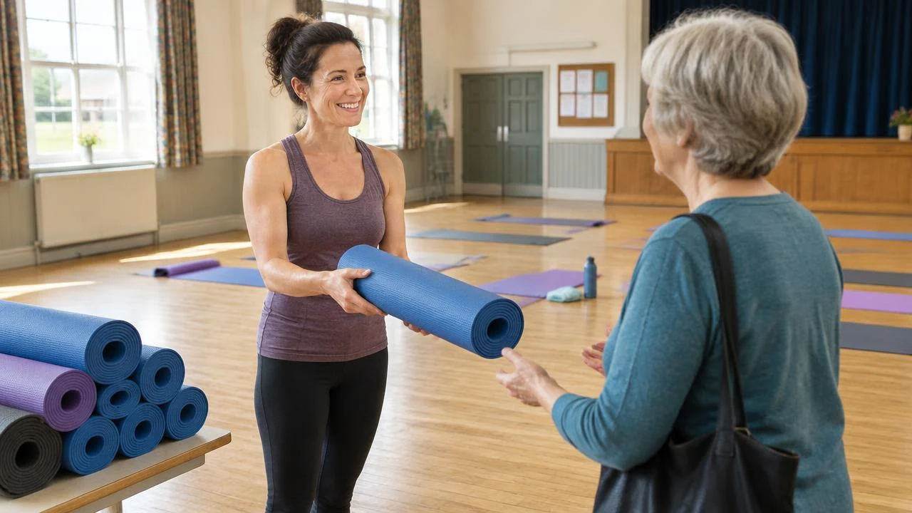
On Tuesday, Ruth turns up ten minutes early. Sal points to the stack of mats and asks how she heard about the class.
“My neighbour sent me the link,” says Ruth. “I wasn’t sure at first. Then I saw the bit about borrowing a mat and booked it there and then.”
She picks a blue one. The mat at home remains gainfully employed in a role for which it is exceptionally well qualified.
Before putting more time or money into attracting yoga students, check that your fees and the number of paid appointments you need add up. Do the maths for your practice.
Once yoga students find you, what happens before, during and after their appointment matters too. Give great service in your practice.
More on be visible online
Where to go next
The same principle in other professions
Ideas often travel well between modalities.

SEO for Coaches: 5 Ways to Get Found by People Who Need Your Help
SEO for coaches starts with the gap between what you call your work and what a prospective client calls their Tuesday. Here are five ways to close it.

SEO for Acupuncturists: 5 Ways to Get Found by Local Patients
Getting found on Google was supposed to be the difficult bit. The harder job is making the words a patient searches, the page they find and the appointment they can attend agree.
SEO for Personal Trainers: 5 Ways Local Clients Can Find You
If the gym is famous and you’re a rumour, local search needs a page about the trainer a prospective client actually wants to find. Here are five ways to build it.

SEO for Chiropractors: 5 Ways to Help Local Patients Find Your Clinic
Neil recommends Imogen by the big Co-op. Help local patients turn half a recommendation into the right clinic, the right door and an appointment.